


U&S | C&A | D&RP | MD&C
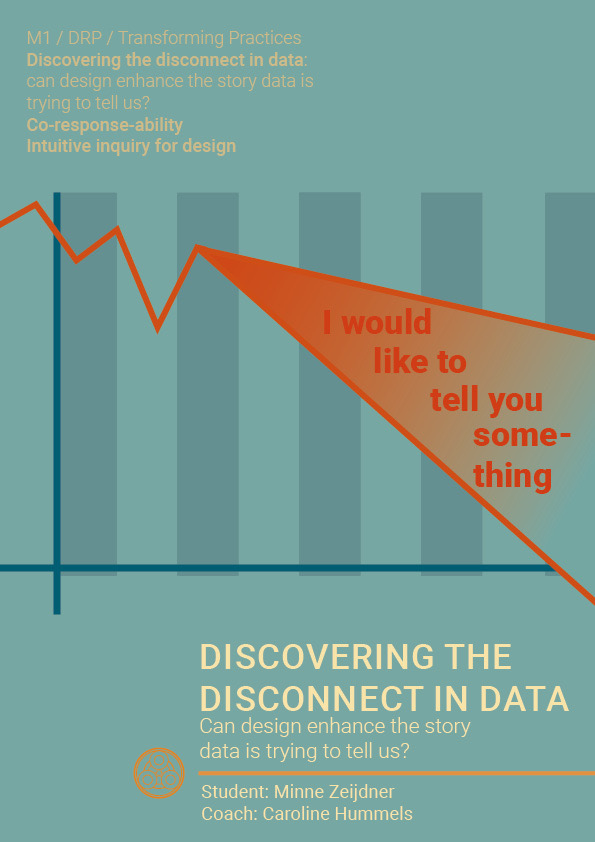
Is there really no better way of presenting data than numbers? In this research through design project I explored whether it was possible to enhance the experience of data through different design methods. To explore this, I used a feminist perspective on the difference between unpaid work between men and women.
Project
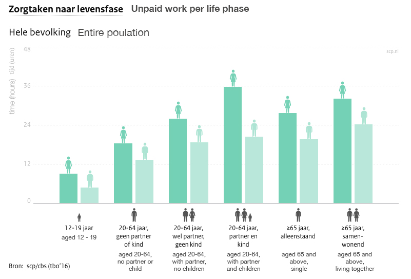
Data and data visualisations are used in our everyday lives, but are they really good for telling the story of data? As design case, I chose to work with the difference between paid and unpaid work between men and women in The Netherlands. I decided to work from a feminist perspective: in order to see women as equal to men, we should value unpaid work more, as women currently do more of this work.
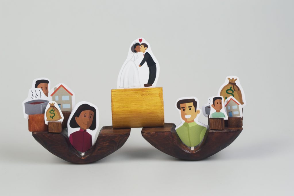
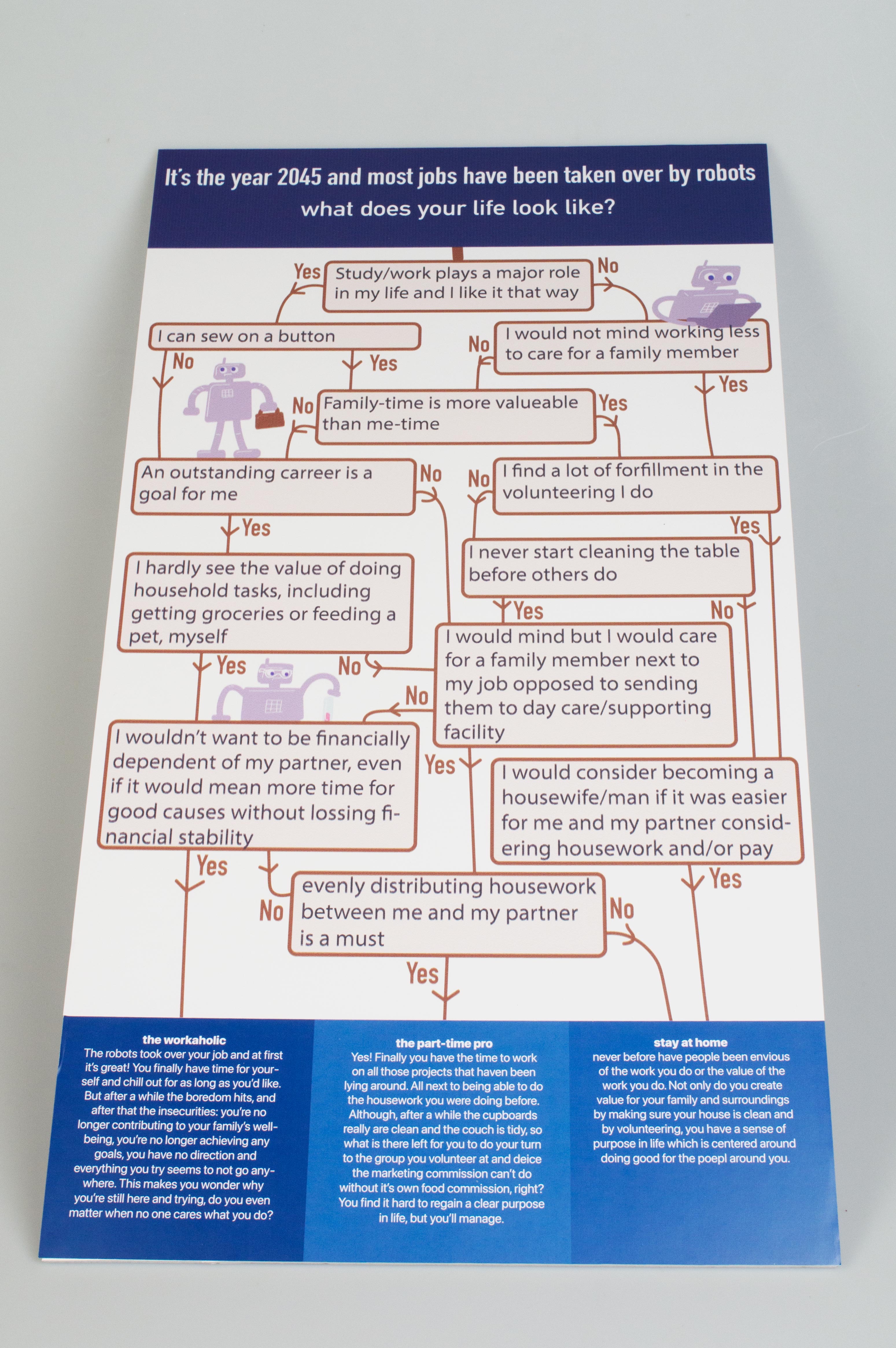
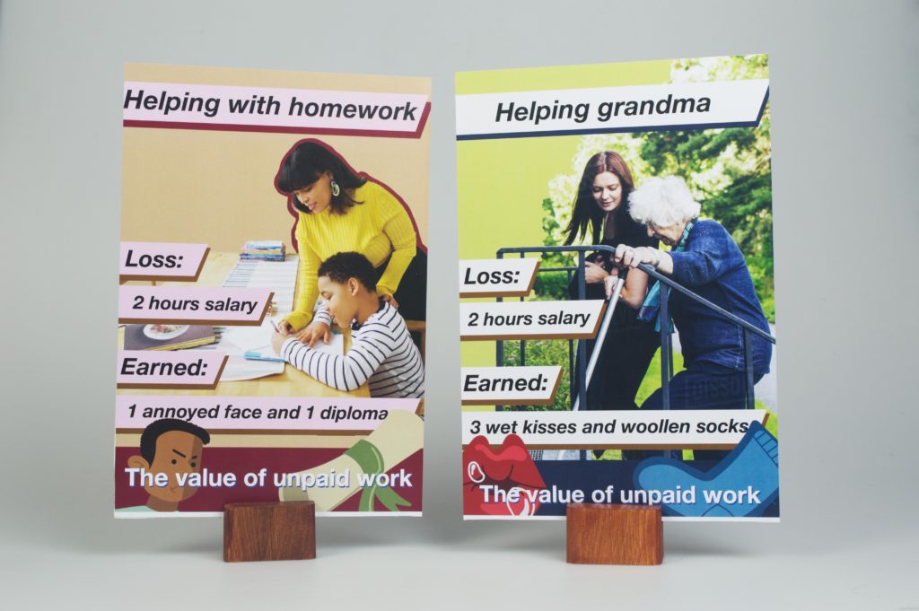
To see if the travel-ability could be increased, I designed three different ways of portraying this statement about the data. The first was a data physicalisation, a method which emerged to make data more experienceable, or is used to improve the cause-effect relationship. The second was based on speculative scenarios, which are being used for confronting people with their current practices by looking at the future. And the third was inspired on SIRE poster campaigns, a way used in The Netherlands to make people more aware of their behaviour.
Research and result
Because of the sudden lockdown, the research was conducted via a survey. In the research the participants were confronted with the graph on the difference between unpaid and paid work, and the designs above. It included quantitative and qualitative questions concerning the understanding, the take-away, and their preferences of the different designs. Participants were also asked about their opinion on unpaid work at the beginning and end of the survey.
In the results I paid attention to whether the participants were speaking from the first-, second- or third-person perspective. Talking from first-person perspective suggested the participants were able to relate to the data. This happened far more in the designs than with the regular graph. Participants also tended to make more personal statements with the designs, compared to the graph.
Reflection
Although the research was not perfect, this project did teach me a lot about doing research. Through the grounded theory approach I dived head-first into the qualitative data, instead of coding it into themes. This same theory also got me into touch with the ideas of constructivism, which later helped me another projects and course, like Science, Technology & Culture, where the objectivity came under discussion.
That being said, the research I did was too chaotic. Because all three designs are based on different subjects and based on different design methods, it is impossible to find common variables. This makes it impossible to draw any proper conclusion from the research.
Geef een reactie